
 27 C
27 C Best Infographics
Elections 2026Science/Tech / Best Infographics

When pros talk about the state of our economy, they often mention our GDP. It shows the total value of all goods and services produced in a country. Have you ever wondered which industries are contributing the most to Americas GDP? This infographic from Ooma takes a look: The post Which Industries Contribute the Most to Americas GDP? appeared first on Best Infographics .
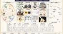
Many of us are guilty of being biased on certain topics without even knowing it. Cognitive biases can affect how we process information and judge reality. This infographic from Rad Neurons decodes 12 different cognitive biases: The post 12 Cognitive Biases Decoded [Infographic] appeared first on Best Infographics .

AI is growing in many countries around the world. Many people assume China and the US are the only players but other countries are starting to get more serious about AI adoption as this infographic from Gadgetify shows: The post Where AI Adoption Is Growing [Infographic] appeared first on Best Infographics .

With the recent conflict in the Middle East, we have heard about the potential for oil prices to explode further. Have you ever wondered why oil prices rise and fall in general? This infographic from Rad Neurons takes a look: The post Why Do Oil Prices Rise & Fall? [Infographic] appeared first on Best Infographics .

It is no secret that as we get older, we dont adopt new tech as fast as younger folks. We have all had seniors who struggle to get a handle on AI, livestreaming and other online tools. This infographic from Ooma covers how kids, parents and grandparents use technology differently: The post How Every Generation Uses Tech Differently appeared first on Best Infographics .
Seedance 2.5 is the most advanced video model. It can make 30 second videos and supports 50 references, including video and audio references. It is an expensive model, so if you are using it, you need to learn how to prompt it. This infographic from Gadgetify has a few tips on that: The post Seedance 2.5 Prompting Cheat Sheet appeared first on Best Infographics .

When you spend long enough time on X and other social networks, you end up seeing all kinds of interesting and sometimes weird topics go viral. In the past few weeks, there have been a lot of talk on X about $20 burritos and who is responsible for those high prices. This infographic gives you [] The post The Anatomy of a $20 Burrito [Infographic] appeared first on Best Infographics .
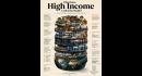
We all hear about high income folks buying all kinds of fancy houses and cars. Have you ever wondered what it would actually take to be among them and what it really looks like? This infographic from Rad Neurons takes a look: The post What Does High Income Looks Like Really [Infographic] appeared first on Best Infographics .
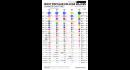
As market conditions change, students are attracted to certain degrees to get a better paying job. AI is going to have a drastic effect on that too. This infographic from Student Choice covers how the top 25 most popular college majors have changed over time: The post How Have the Top 25 Most Popular College Majors Changed Over Time? appeared first on Best Infographics .
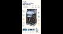
A lot of people invest in fancy ice makers for this time of the year. Have you ever wondered how some of these machines can make more ice in less time? This infographic from Cooking Gizmos covers why compressor ice makers produce better ice: The post Why Do Compressor Ice Makers Produce Better Ice? [Infographic] appeared first on Best Infographics .

Neutrinos are ghostlike particles that can pass through everything. They come from nuclear reactions everywhere in the universe. They are intriguing as they barely interact with matter and change identify when flying. This infographic from Gadgetify sheds more light on them: The post What Are Neutrinos [Infographic] appeared first on Best Infographics .
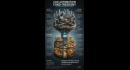
We hear about AI taking away millions of jobs in the future. A lot of politicians and business leaders are thinking of ways to make a post-work society function. This infographic from Gadgetify takes a look at how automation can fund freedom: The post Can Automation Fund Freedom? [Infographic] appeared first on Best Infographics .
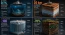
Our universe is vaster and more amazing than most people can imagine. Did you know that Mars has 20km of ice-rich permafrost beneath its surface at high latitudes? This infographic from Gadgetify covers a few mindblowing facts about our universe: The post 4 Mindblowing Facts About Universe [Infographic] appeared first on Best Infographics .